Ensure responsive design.
The viewport audit evaluates how your email’s design adapts to various screen sizes, resolutions, and device orientations. It validates the proper configuration of viewport meta tags, scaling parameters, and responsive layout structures to ensure content displays consistently across mobile, tablet, and desktop environments. The process also confirms that adaptive design techniques, such as media queries and fluid container sizing, are properly implemented to preserve layout integrity and maintain visual hierarchy.
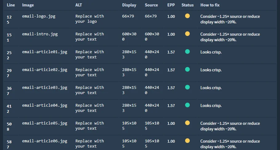
Beyond structural analysis, the audit assesses core readability and usability metrics, including text sizing, line spacing, and image resolution. Each interactive element, such as buttons and links are reviewed for appropriate tap target dimensions and spacing to meet accessibility and usability standards. These checks help identify design elements that may appear misaligned, cropped, or difficult to interact with on smaller or high-density screens.