Optimize for mobile.
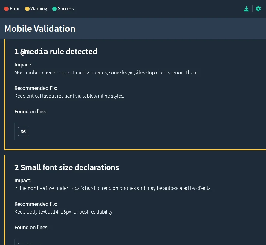
Our Mobile validation ensures that your email is fully optimized for display and interaction across mobile devices, tablets, and desktop-specific clients. The process performs an extensive analysis of HTML markup, structural layout, and client-specific tags to verify that responsive design principles are correctly implemented. It evaluates viewport configuration, CSS media queries, and fluid grid alignment to confirm that your email adapts seamlessly to varying screen sizes and device orientations.
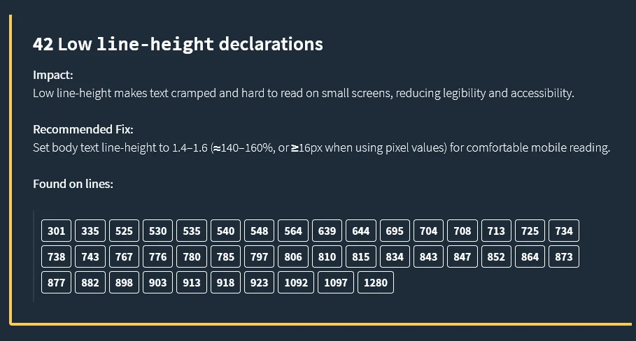
In addition to structural testing, the validation engine examines text readability, font sizing, and content spacing to ensure clarity and legibility on smaller displays. Each visual and interactive element, such as buttons, links, and images, are assessed for appropriate scaling, touch-target dimensions, and spacing to maintain usability and accessibility on touch-based interfaces.